Ready, Set, Go!
Talent is only a starting point”
-Irving Berlin
Filed under: Uncategorized | Leave a Comment
The Decline of American Jobs
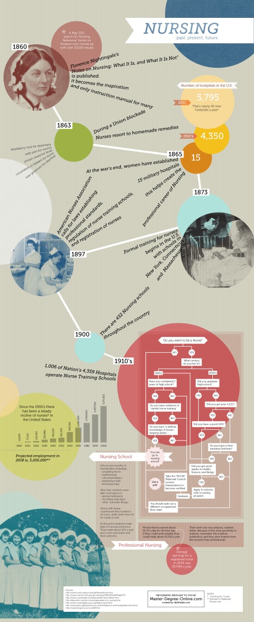
This is the latest installment of infographics by Claire. This one was trickier to research for because the topic is so complex. The initial information wanted was to show why America is losing jobs.
I want to quickly say that the U.S. Bureau of Labor Statistics is the best! They have a TON of different information and if I couldn’t find information I wanted, I’d shoot them an e-mail and within a couple hours they’d get e-mail me back with complete instructions on where to retrieve it. I’m a big fan.
My assessment of the progress that I’m making with infographics is that I need to work on telling the story. I don’t know if the stats I found really have a sequential link to one another, and I’m not convinced that the audience will get what they could/should get out of this. I think as I refine my process this will become better. I had a whole explanation written out about my process, but even that was confusing.
Other than that, I think the design is getting better – look I was able to add some illustrative elements! However, I would like to push into more creative realms. The style is how it is because I knew it worked and I was watching Mad Men while working on it, and there’s something about that 1960’s marketing feel that just screams, “BUSINESS MEETING!”
I will cite my former class-mate Seth Lucas and his BFA for the typography inspiration. I’m still learning how to combine different typefaces creatively, instead of defaulting to Gotham, and I wanted to mimic that style and play with it.
Filed under: design, learning, Uncategorized | 2 Comments
Progress, ahoy!
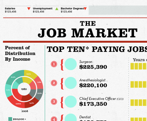
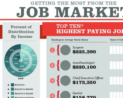
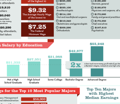
Here is my latest infographic in the line of progress… better, yes? I hope so, because I just got some great compliments from the client.
 It is a lot more visually engaging, and has a really nice flow, especially with the amount of information. I was able to break away from my rainbow color palette; admittedly, I did have a couple yellow swatches, but it looked like so much of what I’ve been doing recently — my BFA, the last two infographics — that I forced myself to nix it. I also don’t cringe at the typography — but who knows, maybe I should (?).
My qualms about this infographic, things I am keeping in mind for next time, is that usually I work with a really concrete concept. I tried to start off with one, it’s about the job market, and while now we look for jobs on Linked In and from Craigslist Postings, the Iconic place to look for jobs is the Wanted section of a newspaper. I also wanted an industrial feel, thus the angular Neutra (because I think it has a little more pizazz than Futura, and personal opinion, I think Futura is overused). I lost my concept when I fell to the mercy of trends. While I love them, the geometrical banner seems to be a visual tool in today’s graphic designer’s bag of tricks. Arguably, I used mine to denote information headers and create flow… but it doesn’t have much to do with any sort of concept. Lastly, while this graphic is FULL of information, I wish some of that information could’ve been paired with some illustrative elements. My last post I admit that my Achilles’ heel of being a designer is my lack of punctuality/using my time wisely — thus, not enough time to render a scalpel to represent a surgeon, or a briefcase for the CEO; nor time to add some texture, and maybe some light gradients to the work to finesse it.
Anyway. Anyone want to weigh in on the topic of trends and concept?
Filed under: design, learning | Leave a Comment
Tags: design, Infographic, job market, progress, trends
My Shameful Confession
My name is Claire Brown, and I am a procrastinator.
I admit, that I have a HORRIBLE… I mean HORRIBLE habit that I am trying to break. My lack of punctuality. Yeah… this might be the worst quality to have as a free lance designer. Deadlines are a pretty important thing, and when you’re juggling a bunch of projects, or a really great project comes up while you’re already working on some other ones, it’s really nice to already be on schedule with said other projects so the stress doesn’t consume you, and your mind is free to be creative. That’s what I imagine it’s like anyway – I am usually behind and have this immense stress-guilt complex that pushes me to finish, and then apologize profusely to my clients. I have had the glorious fortune to work with some really great people, who have not (yet) gotten mad at me (at least to my face/via my inbox) about this character deficiency of mine. If you are in school, ESPECIALLY studying art.. PRACTICE GOOD HABITS!! Get to class on time; get your work done 3 days before it’s due so you can do all that nit-picky refining. DO IT! You will thank yourself later.
Today, I was rushing on a project…
and from 8am to.. well.. 20 minutes ago, I took this:
a 20% done project with a horrible layout scheme, and refined it into this:
a 85% done piece, with a decent layout scheme, with just a few things to finish up. It is amazing what can get done in a day. I can do 65% of a piece in a day, but it suuuuuucccckkksss… I am sitting in my office ALL day. Yesterday was torture, it was 85-degrees, and the pool at my apartment complex was kid free most of the day. Usually, I have to do an all-nighter to finish projects because my bad habit is so awful. While I used to equate those to being a stamp of being a hardcore designer, now it’s just punishment for idiocy. So, blogosphere, I pledge to have a better work ethic. And if pledges don’t work, I’m sure a clause in my contract promising a 10% refund for every day a project is late probably will get me a little motivated.
Filed under: design, learning | 2 Comments
Tags: freelance design, habits, procrastination
Conquering Infographics
I have mentioned that I have started taking on work that requires me to create information graphics. Information graphics are really an every day visual; signs at the bus stop, instruction manuals, charts below a news story, and so on. Artists are refining their presentation and with the onslaught of information and the general attention span dwindling, infographics are becoming more and more popular.
I think I have also mentioned that information design was the most challenging course I took at school. I have no idea why; most other classes I could adjust how I was thinking and execute meaningful designs for. I don’t believe I mastered any class, but I left Information Design knowing that all the work I created in that class completely bombed.
So.. why take on something that I feel incompetent at? Because I want to freaking master this. I made sure I gave the project manager (who’s also a friend) fair warning that this wasn’t something I thrived at, and that he should be harsh and if I didn’t perform well that there would be no hard feelings if he needed to find someone else. Maybe that was a bad business move, but A) I have complexes about being a burden to people and more importantly B) I know the quality and standard of what infographics look like and the way they present information (see Daily Infographic, Good Infographics, and Column Five Media: Infographics ), and I know that I am not up to that level, but I desperately want to work until it’s at that level. I want to have good information graphics in my portfolio of work.
Here is the first information graphic I did — it was going to be gorgeous… but it flopped.
and Here is the one I reluctantly completed at 5am Wednesday morning (I say reluctantly because I know there’s so many things left to do to make it outstanding, but I just couldn’t meet the deadline.
Not to toot my own horn (because I know this last one is not really horn-toot-able by itself) but I am so happy with the progress I’ve been making. Especially with the work I have put into these last two to make them better. Still a long way to go, but progress has been made.
Filed under: design, Uncategorized | 3 Comments
Tags: design, goal setting, infographics, learning
Current Projects
I don’t know if this is interesting for anyone besides myself, but here are some snap shots of some current projects.
These first two are for an infographic I am currently working on. This project has been kicking my trash. It’s supposed to be about Health Insurance Cost by Procedure… but… do you know how complicated our Health Care is here in the U.S.? I was able to find the most common procedures.. and the most expensive ($1,121,800 for an intestinal transplant anyone?) and the most common procedures… but trying to figure out how much of those costs are for insurance (and an average cost for those common procedures, period) is pretty freaking near impossible. I am getting better at finding other information though. So I’m still improving, but I’m not at that proficient level I want to be at yet.
My other project at the moment is a redesign for a couple of wine labels…
I’m messing around with turning fingerprints into vector images…
And playing with gradients in Illustrator to make things look metallic for mock ups… Not a huge fan of gaudy gradients and “realistic” renderings in Illustrator, but this was fun.
 I love being busy..
Filed under: design | Leave a Comment
Tags: Adobe Illustrator, design, Gradient, Infographic, Labels, Research, Wine
Why Design Matters
Phil and I went out the other night; we had tickets to see Eisley in Portland. Before we made it to the show, we stopped by the Pearl District to get something to eat. I had seen this place a couple nights before and wanted to try it. Little Big Burger is like a mod northwest In-n-Out. It was tasty and it was a great experience, but I was a little shocked by how drawn to it I was, and how drawn to it everyone else was. They don’t have a ton of options as far as the menu, it wasn’t cutting edge in it’s appearance, and no one had told me about it, so why did Phil and I have a pretty strong desire to try it out?


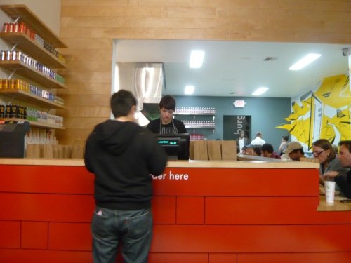
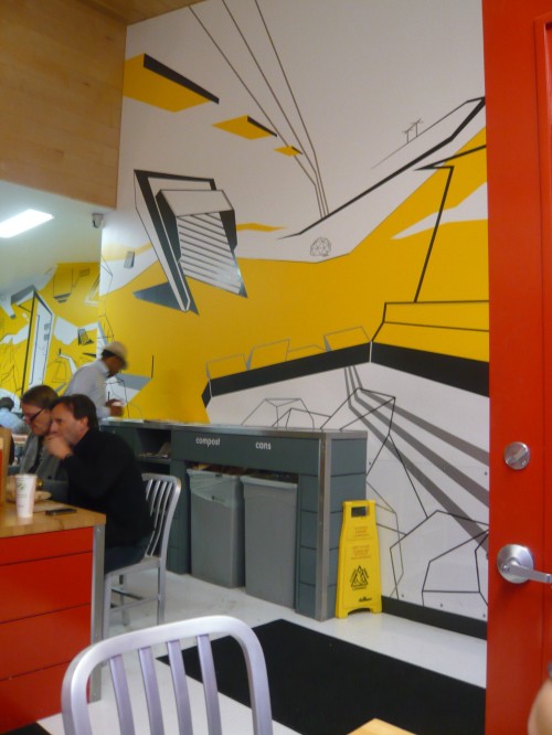
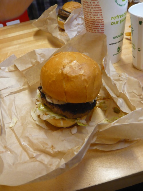

Good, well thought out, Design.
Let me explain what I got out of the design at Little Big Burger, and why I know the designer put more thought into it than just, “I want this to look cool”.
Let’s start with the most prominent part of the design of Little Big Burger: The Color Scheme. Red, Yellow, White, Black, Silver, and Blonde Wood. Red and Yellow are classic attention-getters in regards to food. But, hopefully you can tell that they’re not just trying to ride the successful coat tails of McDonald’s… so what were they thinking?
 Look familiar? Does this remind you of McDonald’s? Maybe a little… Can you see how this famous painting by Piet Mondrian is a little reminiscent of the Little Big Burger brand? Hopefully (although in your defense, all you have are my amateur photos from my visit). A painting based around minimalism, the same theme that Little Big Burger seems to have. A Short and sweet menu, local ingredients, design without any bells and whistles, just classic and essential.
Next, Helvetica, okay fine, it’s Arial, which everyone knows is only the 1982 Microsoft version of Helvetica. Helvetica, is a font designed in the late 50’s after Akzidenz-Grotesk, all three of these abide by a tight grid, a grid that allows them to be seen, but also subdue to the background. Again, no fancy bells or whistles — there for the need of it being there.
Finally, the art on the wall. Compared to my explaination of the typefaces used and the color scheme, the art is a little more fancy than the unpretentious font nor is it essential. But, this restaurant is not from the 1920’s like Mondrian’s painting or the 1950’s like Helvetica, this restaurant reflects a modern/current edge through the art on the wall. The “street art“, still in a grid-like scheme, but modern in style, deters this restaurant looking vintage, but provides a sense of up-to-date-ness that appeals to consumers.
First impressions matter.
Meaning behind your design matters.
Cohesiveness matters.
Designers are not just people who know how to use computer programs, nor are they just authors of pretty pictures. At least for me, being a designer means thinking; tying different messages into one visual package. The general population may not be able to put into words what a company represents by looking at a logo, but they can sense when something is special, or they get a good first impression from something. Those good impressions are from the outward appearance, an outward appearance that is thought out with the general public in mind.
*Please note that I am writing this off the cuff.. I have work to do, but am really excited about posting this. I may come back and get more detailed with my explanation.
Filed under: design | 1 Comment
Tags: case study, design, essay, observation
One Day Logo
A couple days ago my friend, Cory, approached me in desperate need for a logo for a school project. Don’t tell people, because I really do like getting paid for working, but I’m a sucker for invitations of being a helping hand in desperate situations. The trade off for doing things for free is I get pretty much full reins on art direction.
Basically, for a class, he and his group were putting together a brochure or resources for the Latino Community in the small town of Independence, Oregon. This week was a little busier than anticipated, so at the 11th hour (the day it needed to be done), I made my word lists, did a few sketches and took it to the computer. This was the result:
 (South American) Sun, (Latino) Community, (Willamette) River, (Douglas Fir) Trees, and (Oregon) Farmland, all in one concise little package.
Filed under: design | 1 Comment
Tags: Community, Hand Drawn, Identity, Latino, Logo, Oregon
Phew!
Luckily my freak-out a couple weeks ago was short lived. I’ve been able to get connected with a couple different projects, including creating information graphics. Information Design was the most challenging course I had in school, and I was weary to take on the work, but so far it’s been great; seriously rewarding to rise to a challenge and overcome mental blocks. I still have a ways to go before I feel comfortable creating really great information graphics, but the thought of them doesn’t induce weariness/nausea anymore.
I’ve also been working on the finishing touches of Long Story Short Cellars (formerly Cipher Cellars). The logo was finished last night; the label for “God. King. Slave” is in the process of being approved by the government, and needs minor tweaks. And then, OFF TO THE PRESSES!
This logo was a struggle for me, I’m really adamant about having a message in a logo; obviously wanting the logo to nod to its trade of wine making, but also having a young feel, telling the story of two young people starting their long story of wine making…a couple sleepless nights of sketching and mocking, and this is the final result:
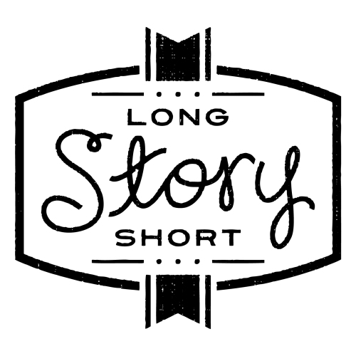 The logo may seem fairly ambiguous, so I’m going to explain the thought behind it:
- The main outline takes the shape of a barrel, often used and associated with wine making (We were really pushing to stay away from images of grapes, vines, and wine glasses — hoorah for success!).
- In a very abstract way the two sides could be viewed as facing book pages viewed at an angle
- The two book marks, top and bottom, are representative of Chris and Christine, the founders. Their current story is short, two young people with a passion for wine, and they have reached a foothold in the wine industry
- The type: Long and Short being opposites but equally supportive of the ‘story‘ are similar in type and placement, nodding their attention to the most intriguing part, the Story. Story, being hand drawn gives a sense of handmade, crafted.
We’re all really excited about it! I’m excited about how the brand is coming together. Christine and Chris are ecstatic about the wine’s release given all the work they’ve put in, and the obstacles and set-backs they’ve had to overcome to finally get to this point of getting their first masterful blend out there for the masses to enjoy!
Filed under: design | 1 Comment
Tags: Branding, Cipher Cellars, freelance design, Identity, Logo, Long Story Short Cellars
Designing and Gender Roles
I was told not to pursue a career, or pick a place that I wanted to live because my husband’s job would determine where we’d live, and my career would be motherhood. Even at age 10, this sounded like gender-role doom… not to mention complete crap. No one was going to tell me what I was going to be based on my sex. I was going to go to college. I was going to study art and be successful and not just successful but one of the best in the industry. In high school, when boys at church joked that I was going to BYU-Idaho to find a husband, their laughing turned to quiet confusion when I retorted that I was going to get my BFA in graphic design. And I went, and I finished my degree. My future husband was at Oregon State, left for his mission to Italy for two years, and waited for me to finish my degree before we got married.
And here I am, my goal of a degree filled. Married. In Portland while Phil is interning. Trying out freelancing… but the offer to get portfolio pieces in exchange for free work isn’t paying the bills, nor is it accumulating any savings for Phil’s next two terms. So what to do? I am nearing in on admitting defeat. To pay bills and have enough money for school I need to get paid, and since I’m not getting paid freelancing, I need to go back to work at a craft store, or as a waitress… I’ll probably have to keep it up until Phil is done with school and gets a “big-person job” and by that time (not that it’s anyone’s business) we’ll probably start having kids. And as I have seen, motherhood is more than a full time job, not a lot of time being a top-notch designer on the side.
Don’t get me wrong, I want to be a mother. My repertoire of being a favorite of my nieces and nephews makes me pretty confident in being a good mother; and if I have half as much fun with, and love for, my own kids that I have for my nieces and nephews then I know it will be a satisfying role. But I can’t help but feel a sense of defeat, and even betrayal to myself. Five years and a ton of debt to be …a mother. A determined attitude and an “I’ll show you” mantra to be proven that I am a slave to my ‘role’.
I know this is coming off so whiney, and in an obnoxious tone of emo-poetic; but what do I do? What are the keys of success of the mother-professional combo?
Filed under: design, Me, Uncategorized, what's going down | 4 Comments

